Wednesday, December 4, 2013
JR Improvement #3 - Concept
Monday, December 2, 2013
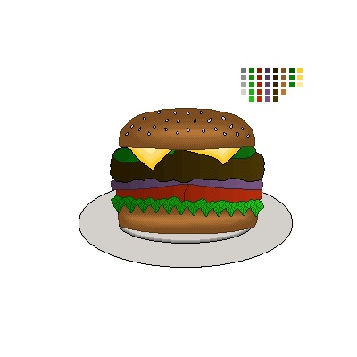
JR Improvement #2 - Final Product

This is the final product for my second project upgrade. Like the maze, I decided to upgrade and change the art style to match the art style of the game. It isn't always easy to turn pixel art into high-quality art, but I am very happy with how this turned out. Also, I changed the shading type on most of the objects from the side-shadow pixel style to the JR edge-to-middle sort of style, which looks more uniform with the rest of the image. The sesame seeds were simple, and don't have any shading, but if shading was implemented, it'd be difficult to spot anyway.
Wednesday, November 20, 2013
JR Improvement #2 - Concept
Monday, November 18, 2013
JR Improvement #1 - Final Product


This is the final version of the JR Maze updated for the final. I decided to go with the idea of changing the realistic looping textures with cartoonish ones to make it much less out-of-place. All of the textures were pretty easy to make (though, the ceiling texture turned out looking rather odd, but that isn't a big deal). They were all done in Photoshop using the Katamari-style simple shading, and it looks surprisingly good in 3D. A problem I encountered while modifying everything was that my new textures were non-looping, and weren't positioned properly. However, once I learned about Maya's Planar Mapping function, I was able to fix all of the textures. I was also able to take advantage of this by making books for the bookshelves around the maze, since they looked rather empty to begin with. In addition, they add more bright color to the maze, which really fits the style. Overall, I'm very happy with how the maze turned out, and I'm glad I was able to make this great upgrade.
Wednesday, November 13, 2013
JR Improvement #1 - Concept


For my first of three (or four, or whatever is decided on) improvement projects, I decided to make another improvement to the maze I recently completed. Despite looking good with higher quality textures, and even though my game is in 2D, I thought that it would look rather out-of-place in the environment of the game. The two different styles of art clash significantly. To remedy this, I am thinking of using the practice I had in making and sizing textures to change the maze to the Katamari-like art style of the game (screenshot example of Katamari shown above). As the screenshot shows, the game uses cartoonish and simple colors, and has very simple shading to match. With this in mind, I am also going to make an even spread of the light sources to control and reduce the amount of shadows to better fit the art style. The blinn textures won't be kept, but I plan to add the same amount of variety to the replacement textures.
Monday, November 11, 2013
JR Maze - Finished Upgrade


Wednesday, November 6, 2013
JR Maze - Upgrade Research


For my game of reference and inspiration for upgrading the maze, I chose The Sims 3. Despite being a completely different kind of game, I thought it would serve as a good reference for spicing the maze up. Since my maze is in a condo, I thought it needed some furniture and variance in the kinds of carpets the different residents have. The Sims 3 has a similar simple graphical like the maze has, and has plenty of examples of rooms and furniture pieces, so I knew it would be a good thing to reference while building furniture to the maze. I plan on utilizing the new dynamic textures in Maya to create different kinds of flooring for the open rooms. For the furniture, I plan to make chairs, sofas, coffee tables, shelves, and maybe even some lamps or TVs. The furniture shouldn't be too difficult to make, as it looks simple enough to build with the 3D Polygons in Maya. I'll use The Sims 3 as a reference to help me decide varietals and textures for the furniture.
Monday, November 4, 2013
JR Maze - Final Model


This is the final version of the maze. Due to the way I drew my plans out, it didn't end up fitting the grid, so it was more difficult to even out the walls and I didn't have the advantage of Maya's Snap-to-Grid feature. Either way, the textures look really good together, and I was able to space out the flower pot walls and doors without it looking too repetitive. The doors are separate objects, but I was able to layers them close enough to the wall so that they don't look odd when viewed from the side. I wasn't able to make a fully looping carpet texture, but the texture still turned out well, as they look like office carpet squares. Overall, it was a little difficult to construct this, but I'm still happy with how everything went together.
Wednesday, October 30, 2013
JR 3D Maze - Base Pieces

These are the current build able pieces for the maze. The textures, for the most part, remain unchanged, but with the floor, ceiling, and the walls now in a tile-friendly resolution. The potted plant was combined with the large wall to create a more interesting repeating patter, as making 3D versions of the potted plants would've been very difficult. The door tile isn't a part of the pattern, as they won't be in every room. They will be manually placed along some of the hallways, to simulate closed doors. I may also place them perpendicular to open doorways, but only if they don't end up blocking some of the hallways. The shorter wall piece is the same shade as the larger wall piece, but the lighting in Maya is making it it look like a different shade.
Monday, October 28, 2013
JR Maze - Concept Final + Textures


This is the final concept and mock-up artwork for my maze. It looks less detailed in terms of color, but I've been to several condos, and the more vivid parts of condo hallways are usually the carpets. The usage of doors reflects the multi-room nature of the maze structures I drew, with some of the doors open for easy access. Aside from that, I decided to add ceiling light and potted plants as decoration. Even though the hallway is intended to have a more basic feel, the light and the plants act as decor to make it more realistic. The metal textures are for other hallways that take place in utility closets, garbage chutes, and vents. The flower pattern is a possible alternate carpet pattern, and I'm thinking of having a carpet pattern for each different difficulty of maze.
Wednesday, October 23, 2013
Maze Concept


Even though my game is a 2D platformer, I was able to come up with a good concept for a 3D maze set. The scenario is that, during the game, JR has wandered into a beachside complex of condos. He must avoid being seen (as he wandered in instead of using the game, so he doesn’t want to be reported to security), and navigate through the maze of hallways to reach the edge of the property. To reflect a condo-like structure, the mazes have several long corridors with multiple exits in each. In each hallway, only one of these exits allows you to progress, while the rest dead-end into people’s condos! Furthermore, the corridors snake around in the harder version, making it less predictable, but also gives more walls to hide behind (from a gameplay perspective).
Monday, October 21, 2013
JR Pixel Building Final
Wednesday, October 16, 2013
JR Prop Pixel Final
Tuesday, October 15, 2013
JR The Game - Building Concept Prop (Week 8)

I've looked at several BBQ restaurants, and I've narrowed my preferred look down to these three. The First two are more traditional and family-styled, with the second fitting the Southern bayou theme of the game. The third image, however, is another approach I'm considering. The restaurant JR owns, story-wise, is a very popular attraction, so a larger and more club-like building style would reflect the business' success. In order to compromise, I'm thinking of using the ,multi-story architecture of the third image, while using the wooden bayou style of the second image. With all of these elements combined, it will have the successful business vibe while still fitting into the theme of the game. If the brick architecture was kept, it would look out-of-place when grouped with the other wooden buildings and structures.
Monday, October 14, 2013
JR Prop Pixel Art
Monday, October 7, 2013
JR The Game - Final Title/Logo

For the final version of my title screen, I decided to go with the fourth style of text (the Polygonal cartoonish text; I drew the text from scratch), while keeping it the same general size. I also thought the grill layout would look a bit awkward (the text would be on top of the grill as opposed to being centered), and I didn’t want to scrap the colorful lights the original title had. So, I decided to “enhance” the original title by utilizing the wooden board layout. It was a little difficult to draw by hand, but I was able to use photoshop to work it to the lighting and shading style the game uses. The Spatula had be moved down a bit, but I was otherwise able to integrate the two accessories.

As for the logo, I decided to utilize the two props, as they represent the protagonist and antagonist of the game. The two “accessories” are crossed at different angles, to give the look that they are clashing against each, not unlike the clashing of two swords. However, I decided not to include a sort of “kapow” jagged bubble as a backing for the logo. Despite adding more space, it would give people the impression of a kind of fighting game, as opposed to an adventure platformer game.
Tuesday, October 1, 2013
JR Revised Title Image - Concepts

These were the titles that served as inspiration for my revised title concepts. They all have titles that follow a set color or group of colors, while keeping a more simple shape. Still, each of these the styles is unique, but they all work well with my game's graphical style. The Katamari title inspired the usage of a matching "backing" for the title text. I was looking into a more interesting text backing, as the one on the current logo is a little too simple and doesn't fit the theme as well as the other objects. The wood in the bottom text for the Donkey Kong logo inspired the design for one of these backings, as the wood fits the themes of both games. Furthermore, the logo's spears inspired the idea of possible props leaning against the title's backing.

I chose four possible graphical styles to use for the text, that both fit the theme and don't use too much warping in the text. The first one is a rather basic style that the Sonic title inspired, which is similar to what I already have now. The second one is a more loose stroke text, which is based on the top text on the Donkey Kong logo. The third is a cartoony bubble text similar to Katamari Forever's, that mixes simple coloration with a more complex letter shape (though, I'm not leaning towards this one). The last kind of text is the one I'm leaning towards. It is a kind of mix between different styles while still being unique, taking on a more simple polygonal feel. I might even add a stroke to it to help the details stand out.
The two title "backings" I'm deciding between both are based on the game's theme. The wood was inspired by the wood in the Donkey Kong logo. I thought went well with JR, as the wood fits the southern swamp/marsh theme, and matches the kind of wood used in boardwalks and the BBQ house walls. The second one is original, and is based on the top of a BBQ grill. On this one, the title would be on top of the grill's grates instead of in the middle. I'm leaning slightly towards this one, though I'd have to sacrifice the flashing lights on the existing logo due to perspective.
The two "accessories" are optional pieces I might add to give the logo a bit of flair. Inspired by the two spears on the Donkey Kong logo, these would represent the two opposing sides/protagonist and antagonist of the game. They would also help make the logo a bit more memorable by having a unique detail that isn't often seen.
UPDATE:
Here's a sketched diagram of an example layout (minus the styled text and flashing lights) of a title with the wood "text backing" and both accessories. Just wanted to make it easier to see where I'm going with this title.

Monday, September 30, 2013
JR The Game - Title Screen Final
For the final version of my title screen, I decided to keep the same ideas I had during development. I also added in menu options that match the text style of the title, that highlight when they are selected. As for the other animations, they all transferred over well, even though it took some layer effect tricks to animate the flashing lights (I had to utilize color overlays with the color blend style). The only animation I wasn't able to insert was the up-and-down motion of the sombreros, as I couldn't combine it with the forward movement. Aside from that, everything turned out well, and those who saw it in progress really liked it.
Also, I apologize for the low quality of the video. The raw mp4 file was the original resolution, but Blogger down scaled it when it was uploaded.
Wednesday, September 25, 2013
JR The Game - Title Screen Concept


For this title screen, I decided to go for an image that acts as a “premise” to the game’s story. As you can see, there is a silhouette of JR monitoring a conveyer belt with completed customer orders headed to a room for waiters to pick them up (these customer orders double as models for the in-game food items that JR can pick up to regain energy). The other major part of the shot is the window to the back “yard” of the restaurant. Here, we can see Pedro hiding among the reeds, scheming and readying his siege on the business. Behind him, the line of sombreros is a group of minions sneaking through the reeds.
There are several parts of the screenshot I decided to animate. The first is the conveyor belt. This is to scroll several different moving food items on screen, which both adds to the atmosphere and shows the player the kind of food the restaurant makes. Then, there is the flashing lights around the title, which contains a moving pattern of lights not unlike that seen on movie theatre signs and those annoying crane games in arcades. In the background, the line of minions has an alternating pattern of bobbing up and down while moving forward. To complement this animation, the reeds they are walking through will move back and forth as well (each bent using the “puppet distort” effect).
Monday, September 23, 2013
JR The Game - Mood Board Final

The color schemes chosen for my concept images were well-received, and the color choices well-defined the images. So, I felt that I didn’t need to overhaul the color scheme to define the game or to make things stand out. For the final product, Instead of simply updating the concept images presented earlier, I decided to take some of those elements and put them in a mood board together, to see how well their color schemes would work together.
Using the colors I had picked out earlier, I modified some of my existing graphics, as well as making some new ones, to create a board that has a more consistent art style. Similar to the Katamari art style, I used the color bar by color bar simple shading and art style for the shading of most objects (I’ve used this kind of shading when modifying pixel art, so I’m pretty fond of it). For example, the pier/boardwalk, while looking like pixel art, was an attempt at a pseudo cel-shading effect that uses this style. The beams of sunlight reflect the simple lighting style, but I made that one a little differently. All of the “layers” of color are actually the same color, but they are of gradually decreasing opacities.
Overall, the goal of this image was to work the different elements towards the same art style, while making their respective color schemes go together. Even in a simple art style such as this, the contrast between vibrant and earthy pastel seems to have worked out well.
Wednesday, September 18, 2013
JR The Game - Palettes and Color Schemes

This graphic is a wallpaper of the Katamari Damacy game series. Aside from the rather silly-looking characters and landmasses, the game has a very distinct art style that is serving as inspiration for my own. The colors chosen in the art are a mix between bright and earthy tones, but they’re all applied to simplistic shapes, and they are all in a pastel style. The shading is also very simplistic, and you can see that in the fact that each part of the shade is a layer of a single color, instead of a smooth realistic transition.
The art style gives off a cartoonish and non serious vibe, which the colors and the simple shading enhance. The artists probably chose this style to reflect the crazy and nonsensical nature of the game overall. You’re rolling a ball around and picking up objects to make your katamari bigger, and the objects tend to be crazy or do crazy things (examples being sheep on mopeds, penguins on a couch, etc.), so they went with an art style that matches the situation. As with the characters, they went for bright, crazy colors, to both follow the vibe of the game and to make them stand out (the King’s multi-colored pattern on his long helmet thing is a notable example). Their overall intent is to give off a relaxing but silly vibe that will give the player a good laugh while playing.


With JR The Game, I am going for a similar art style, but with a bit more detail. The graphics I picked to extract colors from demonstrate the different color schemes that different elements of the game will have. Like the environments in Katamari, the environments in JR will have pastel earth tones that match their setting, which will gain more brightness and color as the game progresses. However, they will still sit in the same general range of brightness between levels. Each level will have it’s own palette of appropriate tones that follow an overall color scheme, but will still look more unique on each. The big exception will be Fiesta city, which will have it’s own bright and festive color scheme through it’s own levels.
The graphics used as references for the color palette, however, are realistic images. I hope to simplify the color amount in each one to create more fitting environments for mood boards.
The characters follow a different style. Like Katamari, these characters will consist of brighter colors and extra details (while staying true to the cartoonish theme). As you can see on the character palette, the tones selected are less pastel and less earthy than the background palettes, and they contain a much wider array of colors. it also shows the contrast between JR’s and Pedro’s color schemes, JR having brighter versions of his environments’ earth tones, while Pedro has vibrant and festive colors to go with the vibe of his Fiesta City environment. I plan to give the game’s enemies a similar color scheme to Pedro’s. The overall intent of this contrast is to make the characters stand out more easily while still fitting in with the game’s overall style.
Monday, September 16, 2013
JR The Game - Final Concept


Abstraction and Realism: Being a non-serious and generally humorous game, the art takes on an abstract and cartoonish style, similar the the style utilized by the Mario series and Genesis-era Sonic the Hedgehog games. The weapons Pedro’s minions utilize are toned to fit the light hearted and comedic theme. For example, hot-sauce-filled gasoline tanks, and paint-firing pistols.
However, some realism is still utilized in the game’s concepts. Aside from the salt-water gimmick, one of the game’s main gimmicks centers around the fact that JR is cold-blooded. This gimmick takes the form of an energy meter. The meter goes down slowly over time, and results in a lost life if emptied completely. Therefore, JR must find sources of energy periodically. Rays of sunlight will slowly fill JR’s meter while resting within them, while buckets of BBQ food will fill a part of JR’s energy meter instantaneously. The amount filled depends on the kind of food.
The gimmick is further built upon during the Fiesta City levels. As they all take place at night, where are no rays of sunlight that JR can utilize. Instead, he can utilize heat lamps found in various places throughout the city. His BBQ food is also much much rarer throughout the city, and in it’s place is much of Pedro’s own kind of food. This food, however, causes JR to LOSE energy, so he must utilize his resources carefully when traversing the city.

The game’s takes place within the recent decade. However, technology does not play a large role during the main part of the game. This is due to the emphasis on natural environments. The one exception to this rule is the highway levels, as vehicles such as cars, trucks, and motorcycles are present, and their rooftops utilized by JR to cover a large portion of ground. Technology makes itself more present once the plot twist comes around, as JR rides a train to Fiesta City, and frequently utilizes taxis (with parades acting as obstacles!) and subways trains to navigate the large complex metropolis.
Wednesday, September 11, 2013
JR: The Game - Concept of a Concept

The concept of this game is centered around an alligator by the name of JR. His character is rather eccentric and wild, being from the southern USA, and he always has a big appetite for food and mischief. His appearance will be similar to that of a normal alligator, only more upright and cartoonish, along with sporting several oddball accessories such as sunglasses. Due to his love of food, he owns a very famous BBQ restaurant and club, which I plan to have involved in the game’s plot. I also plan on giving JR a sort of “sidekick” who would assist JR in several of the game’s areas.
The game’s location, of course, takes place in the southern United States, mainly in places like South Carolina, Florida, and Louisiana, with the time period being within the past few years. With a southern setting, I plan to have several gator-inhabited environments such as swamps and marshes, with a few more urban areas mixed in when you reach later levels. The color scheme will start of rather glum while visiting the swamps, but will slowly progress to brighter and more festive colors as you progress throughout the game.
The game is intended to be abstract and cartoonish with it’s art and environments, with a general trend towards silliness. However, there is a mechanic that the game will have that throws some realism into the mix. Being cold-blooded, JR needs heat in order to sustain his energy. This will add a new element to the gameplay, that will require the player to keep JR’s energy up to progress through the levels. As his energy and temperature reduces, he will slow down, with a life lost if all energy is lost. In order to refuel energy, JR can relax in bright rays of sun, which will slowly refuel his energy while inside, while plates of BBQ food (burgers, steaks, chicken, pork, etc) fill his energy meter instantly.
The above images are a few examples of reference images for the different environments, character inspiration, etc.
Monday, September 9, 2013
Rock Paper Scissors - Finished Product

This more final version of the project went very smoothly, and was fairly easy to make. For the layout, I decided to mix elements that worked from the two different proposed layouts. I didn't use the exact design of either of the two due to space constraints. The biggest issue with space was fitting them all at the bottom with the rules, so I decided to add them to the diagram instead.
The comments other students made on the plans referenced that I hand-drew the individual elements planned for the page. While I planned to scan some of the drawings, I didn't have much time to do so, plus then hands I drew weren't that well drawn compared to the others. So, for the most part, I stuck to using images from Google for the hands and objects (with some modifications). However, I did hand-draw the arrows in Photoshop, which turned out pretty well and close to the way they were on the notebook page. I also hoped to simplify/remove color from the elements taken from Google, in order to make their appearance closer to that of the drawings, but I couldn't find a function for this in Photoshop.
As for other elements, I stuck to a color scheme of greys for the background, and with shades of blue for the boxes, bubbles, and glow effects on most of the text and images. This also made the "fiery" colors on the arrows stand out more, which contributed to the design of the diagram and added some contrast. Even though I originally planned for a Rock Paper Scissors symbol border, I instead decided to use this pattern for the background. The inspiration came from the poster of another student's Metal Gear Solid variation of this game. That poster contained a watermark background, which filled the empty space between the text boxes. Since my background looked a little empty beforehand (being a simple dark-to-light gray gradient), I knew that implementing the pattern into it would tie this project together.
Wednesday, September 4, 2013
Rock Paper Scissors - Concept Art

The planning process for this project was fairly simple, and I am deciding between two distinct layouts for this particular project. However, I am leaning closer to the second one. While the first one adds a bit more creativity with having the rules in the middle of the cycle, I thought that having the objects and their representative hand positions next to each other wouldn’t allow a lot of room for the “cycle”. In the second one, I decided to have the cycle in the middle and have the hand positions next to the rules to balance it out a bit more. Still, maybe elements from both layouts could be combined, but I’ll base that on user feedback.
The graphics for each piece of the diagram were basic objects, so looking for good reference images on Google wasn’t a difficult task. The paper was very easy to create, but looked rather simplistic when compared to the other two objects. From that, I decided to find a good image of paper with a corner folder over, which allowed the graphic more depth and a bit of shadow. A standard recycling icon was used as a reference for the arrow graphic for the diagram. However, I decided to add spikes to it. The purpose was to give it a more “offensive” or powerful look, representing one object being strong against another. The border was a simple idea to fill up the more empty spaces on the page with a line of silhouettes representing each object in a pattern. I’m really thinking of using this to give the poster a more decorative touch.
Subscribe to:
Comments (Atom)