Wednesday, December 4, 2013
JR Improvement #3 - Concept
Monday, December 2, 2013
JR Improvement #2 - Final Product

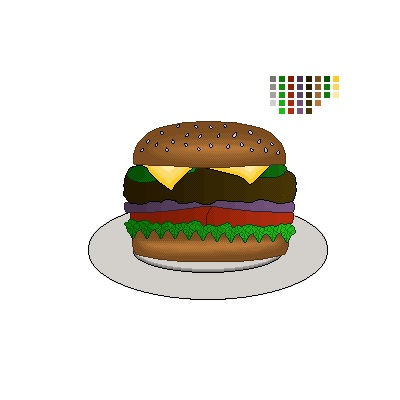
This is the final product for my second project upgrade. Like the maze, I decided to upgrade and change the art style to match the art style of the game. It isn't always easy to turn pixel art into high-quality art, but I am very happy with how this turned out. Also, I changed the shading type on most of the objects from the side-shadow pixel style to the JR edge-to-middle sort of style, which looks more uniform with the rest of the image. The sesame seeds were simple, and don't have any shading, but if shading was implemented, it'd be difficult to spot anyway.
Wednesday, November 20, 2013
JR Improvement #2 - Concept
Monday, November 18, 2013
JR Improvement #1 - Final Product


This is the final version of the JR Maze updated for the final. I decided to go with the idea of changing the realistic looping textures with cartoonish ones to make it much less out-of-place. All of the textures were pretty easy to make (though, the ceiling texture turned out looking rather odd, but that isn't a big deal). They were all done in Photoshop using the Katamari-style simple shading, and it looks surprisingly good in 3D. A problem I encountered while modifying everything was that my new textures were non-looping, and weren't positioned properly. However, once I learned about Maya's Planar Mapping function, I was able to fix all of the textures. I was also able to take advantage of this by making books for the bookshelves around the maze, since they looked rather empty to begin with. In addition, they add more bright color to the maze, which really fits the style. Overall, I'm very happy with how the maze turned out, and I'm glad I was able to make this great upgrade.
Wednesday, November 13, 2013
JR Improvement #1 - Concept


For my first of three (or four, or whatever is decided on) improvement projects, I decided to make another improvement to the maze I recently completed. Despite looking good with higher quality textures, and even though my game is in 2D, I thought that it would look rather out-of-place in the environment of the game. The two different styles of art clash significantly. To remedy this, I am thinking of using the practice I had in making and sizing textures to change the maze to the Katamari-like art style of the game (screenshot example of Katamari shown above). As the screenshot shows, the game uses cartoonish and simple colors, and has very simple shading to match. With this in mind, I am also going to make an even spread of the light sources to control and reduce the amount of shadows to better fit the art style. The blinn textures won't be kept, but I plan to add the same amount of variety to the replacement textures.
Monday, November 11, 2013
JR Maze - Finished Upgrade


Wednesday, November 6, 2013
JR Maze - Upgrade Research


For my game of reference and inspiration for upgrading the maze, I chose The Sims 3. Despite being a completely different kind of game, I thought it would serve as a good reference for spicing the maze up. Since my maze is in a condo, I thought it needed some furniture and variance in the kinds of carpets the different residents have. The Sims 3 has a similar simple graphical like the maze has, and has plenty of examples of rooms and furniture pieces, so I knew it would be a good thing to reference while building furniture to the maze. I plan on utilizing the new dynamic textures in Maya to create different kinds of flooring for the open rooms. For the furniture, I plan to make chairs, sofas, coffee tables, shelves, and maybe even some lamps or TVs. The furniture shouldn't be too difficult to make, as it looks simple enough to build with the 3D Polygons in Maya. I'll use The Sims 3 as a reference to help me decide varietals and textures for the furniture.
Subscribe to:
Comments (Atom)